Heat map × A/B test × EFO
to dramatically
improve your site
Number introduced in Asia
1,000,000
break through the site
Equipped essential heat map
· A/B test · EFO · access analysis
report everything to the analysis and improvement
of the web site access analysis
report we have everything.
With one SiTest
your site is
it changes dramatically
「Heat Map Analysis」 「A/B Test」 「EFO (Entry Form Optimization)」 「Access Analysis」 is all possible with SiTest.
Since there is no need to make a contract for each tool, it is far superior in cost performance and it can turn PDCA at high speed.

Heat map analysis
Heat map analysis
do not use tools
site renewal
it is too dangerous anymore
「8 heat map analysis tools」 are standard installed in SiTest.We can see usability problems and improvements to raise UX (user experience) which we did not know with conventional heat map analysis.
Of course we also support smartphones.
Is there a secret to
increase the conversion
rate to the segment
heat map for each
inflow medium?
For example, it is possible to compare heat maps in segments such as 「Natural Search User and Advertisement Users」 or 「Users Who Never Returned」.
In addition, segment comparison by URL parameter is also possible, so you can visualize user's movements by keyword advertisement. Using the heat map tool and the segment comparison function increases the accuracy of the hypothesis.
Verify the outcome of the
measures with the time
comparison function of the heat map
Comparison of periods in which heat maps of different periods can be verified side by side, such as before and after the promotion campaign.
SiTest is the evolution version of the heat map tool that only it enabled.
(Patent pending / application number: Japanese Patent Application No. 2014-157019)
A/B test
I tried the A/B test
for the first time,
but I am surprised
that SiTest is so easy
All A/B test settings can be done on the management screen, so there is no need to prepare a separate page at all.
Since you can enter patterns of text and change elements with drag & drop, knowledge of HTML / CSS is unnecessary.
It is Suguremono which takes less time and effort.
Do you not easily realize
the landing page linked
with the advertisement?
With SiTest you can easily implement LPO (landing page optimization) at high speed.
There is no need for complicated preparations and additional costs such as "prepare HTML" and "outsource design and coding".
EFO(Entry Form Optimization)
EFO(Entry Form Optimization)
Enhance sales with EFO
It is a great opportunity loss of the user who arrived to form resulting in the withdrawal to give up.
By EFO (Entry Form Optimization) measures SiTest,
To up CVR is 1.5 times or more in addition to improving the form, it does not mean no longer unusual.
of EFO >
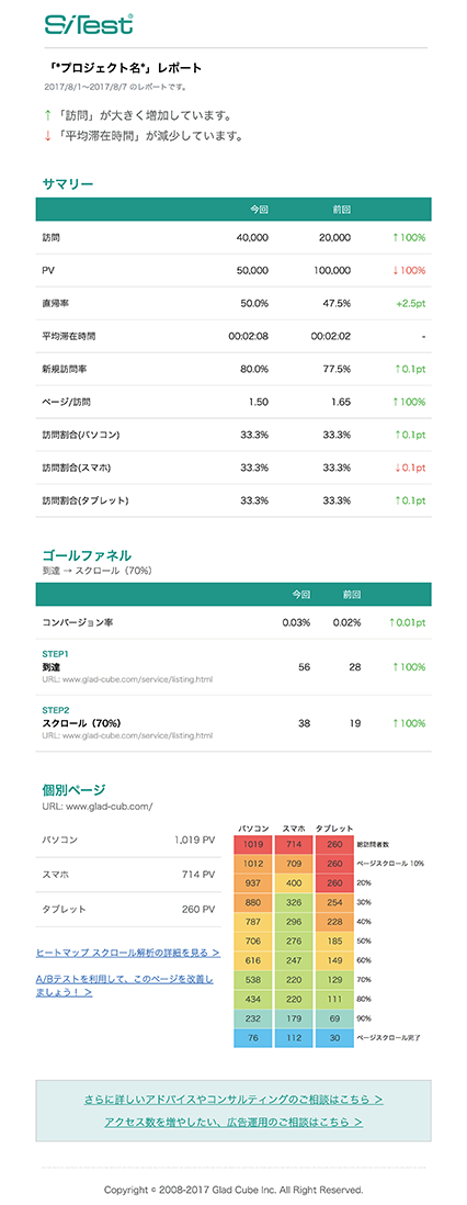
Access analysis report
AI (artificial intelligence)
instantaneously finds
a problem from
heat map analysis
and access analysis data
With SiTest's AI report · Smart Report you can start data-driven web improvement without learning, as it is difficult to advise easy-to-understand improvements from website data.
Improvement advice is provided simply by reporting, such as heat map analysis information, multilateral site evaluation, social analysis, day-of-week analysis, etc.

Every Monday,
see the access analysis report e-mail
sent automatically only.
You do not have to ... My God all night because of the report for the report in the weekly meetings?
You do not need to anymore you to do such a thing.「Auto e-mail report」 of SiTest will automatically send a report in the weekly e-mail.

